From the perspective of someone who has been teaching for the last 15 years, the Microsoft Learn platform is frustrating on so many levels. There is plenty of content, some of which definitely wasn’t AI generated, but in the end it feels like a poorly formatted series of textbooks with a handful of useful projects tacked on. For a multibillion dollar company it’s a poor attempt at education content.
Up until recently, my AI-related side projects would train and run fine on my graphics card, but with the advent of LLMs, that’s not always the case. The smaller models still work, but sometimes I want to play with something a bit bigger, or spend less than a few days training, and so need some cloud compute time.
I have used smaller providers in the past, but I’ve been thinking that I’d also like to learn the ins and outs of something that would help out workwise. After spending time reading through forums filled with complaints about the big three (AWS, Azure, GCP) I found consensus was that Azure was possibly the least worst, and so I figured I’d give it a go.
Azure, like Google, offers a nice initial chunk of credit to burn through. They also have a series of tutorials on all things AI, including certification courses. I already have what I assume to be a decent understanding of the fundamentals of machine learning and general AI, but I decided I’d start at the beginning of these tutorials and see if they’d work for students or friends who might want to learn.
Fundamentals of AI Concepts is the first course the certification gives you. It’s mostly a series of commercial-like videos on the uses of AI followed by bulleted lists of vocab words.
One thing that immediately stands out is how poorly formatted the documents are. Everything is left aligned, including images and videos, with no color coding for vocab words. Figures and diagrams are not numbered and have no subtext. I’m going to assume they were created using a flavor of markdown and that no one decided it was important enough to go the extra mile to make things look nice.
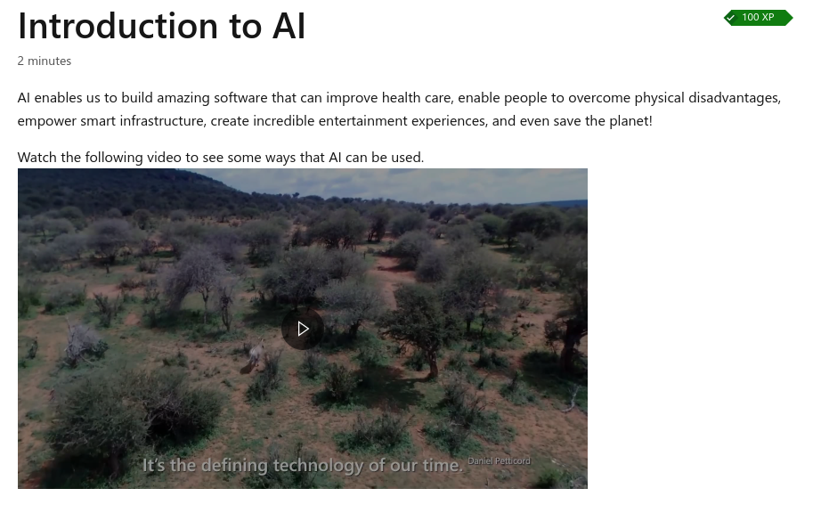
Also, each page is referred to as a unit, which seems wrong to me, as a unit more often refers to a collection of lessons falling under a single topic. All 10 of these first lessons would constitute a unit, though they refer to it instead as a module.
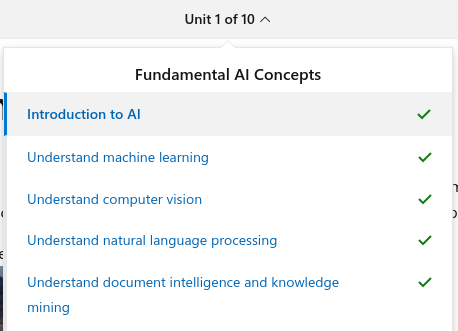
When going back to look at these units I noticed that at the end of each of the 10 units from this module I got the option to Unlock Achievement, even though I’d already done so.
Why wasn’t it shown as completed?
The next module I looked at was the Fundamentals of machine learning and this is where things got interesting. There were three main areas that bothered me: diagrams, tables, and the math. Within each of these content itself was correct, but mostly dry and lacking proper background knowledge, context or visualizations.
There are a number of diagrams like this and this which come with some information on what is happening, but without clarifying the surrounding vocabulary or explaining why it’s done this way. For example:
Split the training data (randomly) to create a dataset with which to train the model while holding back a subset of the data that you’ll use to validate the trained model.
If this is my first exposure to machine learning, which this tutorial is assuming, I’d already be lost on what is meant by training data, why it needs to be randomly split, and what it means to validate a model. What is even meant by a model?
Granted, there is an example after this, but why not start with the example, and explain the concept through that? Instead, users are presented with a diagram showing things like [x1, x2, x3], y with the assumption being the reader will understand what’s going on from the vocab laden text provided.
Still, the best diagram comes in section 7 on clustering where they introduce us to these flowers:

At least the image that follows is animated, which does help, but it’s perhaps one of the more confusing introductions to the relatively simple concept of clustering that I’ve seen.
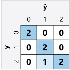
Another one I like is here where they don’t even bother to remove the gray background from the confusion matrix:
And then finally, the diagram showing deep learning is followed by a series of bullet points which drops in a ton of vocab and no real explanation of how anything works.
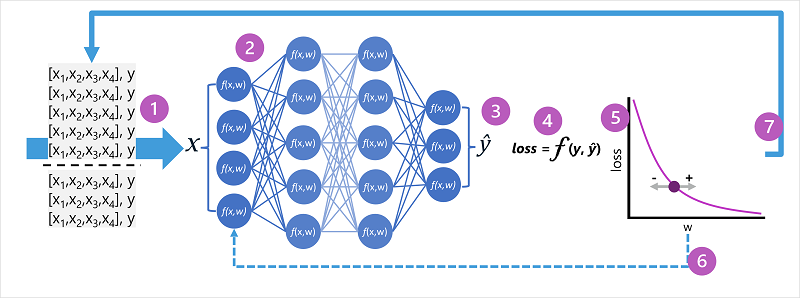
So many of these diagrams would have been better broken up and explained piece by piece, but almost all of them are followed by chunks of text which make it difficult to follow what is actually happening.
Full-width tables for two columns of two-digit numbers look ridiculous. Why not put these tables side-by-side with their corresponding graphs and use their descriptions for the axes as opposed to just x and y?
If you’re on a desktop or laptop just wander over to this page to get an idea of what I’m talking about.
From a technical standpoint there is nothing wrong with the math, it’s just that it’s introduced without any detailed explanation. They use ŷ (y hat) without even giving its name, and discuss sigmoids and probability distributions without any indication of why they’re important. So much of it just plopped down, as they had ChatGPT summarize a Wikipedia article and give some cursory examples.
In the section on deep learning the entire process of feed forward and back propagation are explained with descriptions of the math, but with little or no math itself. Maybe they could have used Github’s markdown renderer which allows mathematical expressions. At the very least export an SVG using Katex, but I suppose that would be more work.
These tutorials are overall awful. From a pedagogical perspective only one step up from using Wikipedia, and that’s only because the modules usually include a practical exercise like this one.
If you want to use these tutorials to get an idea of how to use Azure, I’d skip to the practical sections and find alternative sources to learn the background info.
Now, I’ve whined a lot, and it’s easy to be critic, but these tutorials really do need a hell of a lot of work to ever be usable. I did bounce around a do a few other non-AI modules, and found them to be hit and miss with regard to quality. I’d say most were on the crap end of things.
What I plan to do next is to take one of these units and rewrite it as a example of how it should be done. I’ll link it back here when it’s complete.